All projects
E-commerce
Skincare
2026
Sunera: skincare shopping that builds trust.
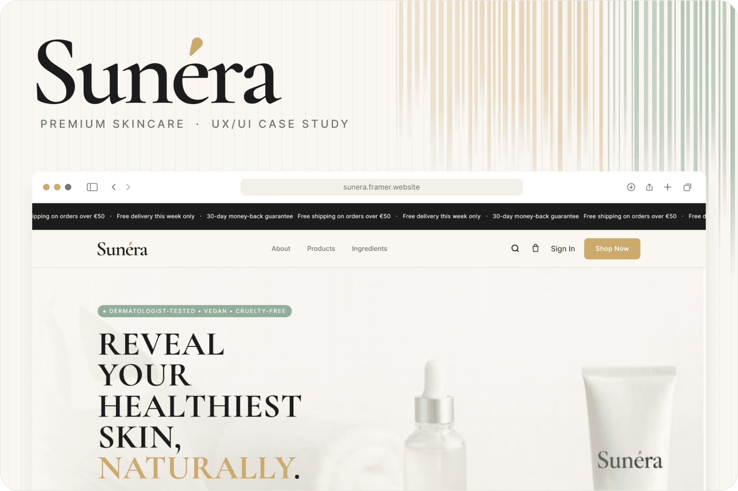
A premium skincare store that guides people from “I have a skin concern” to “I found the right product, I trust it, and I’ve bought it.” Designed in Figma, built live in Framer.
Project
Skincare e-commerce
My role
UX/UI Designer
Timeline
Research → Design → Build
Tools
Figma · Framer

2 clicks
From any page to a product
12 products
A CMS-driven catalogue
3 breakpoints
Desktop, tablet and phone
Overview
Hundreds of products, unfamiliar ingredients and countless skin concerns make skincare shopping overwhelming. Sunera balances four things (beauty, clarity, trust and conversion), so shoppers find the right product and feel sure about it.
The problem
The problem wasn’t a lack of information, it was how information was presented. Shoppers were left asking:
Which product is right for my skin?
What does this ingredient actually do?
Is it suitable for sensitive skin?
Can I trust the reviews?
How might we make skincare discovery easier while creating a premium experience people trust?
Who it’s for
The Curious Beginner: “I want to start a routine, but I don’t know where to begin.”
The Routine Builder: “My routine works. I just want to make it better.”
The Concern-Focused Shopper: “I need something that actually works for my skin concern.”
Design decisions
Which product is right for me?
Guided discovery
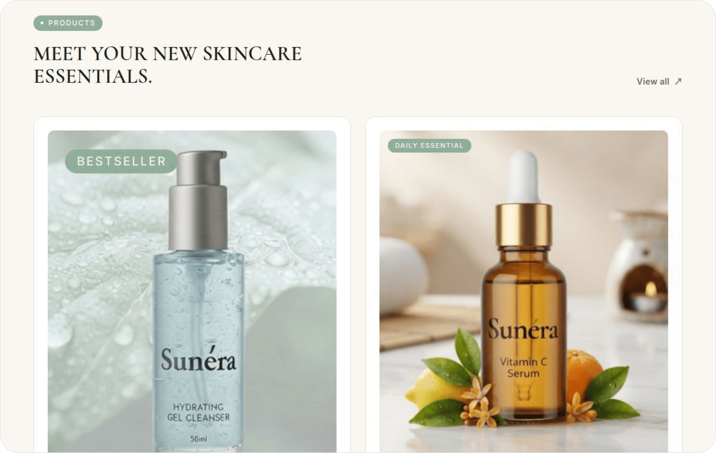
The decision: Products framed as a three-step routine (Cleanse → Treat → Moisturise) with a one-line benefit on every card.
Why it matters: Beginners get a starting point; routine builders see where each product fits.
What does this ingredient do?
Plain-language ingredients
The decision: Key ingredients on every card, and an Ingredients page explaining nine actives in one sentence each.
Why it matters: A plain explanation turns a label into a reason to believe.
Is it suitable for sensitive skin?
Safety signals above the fold
The decision: Dermatologist-tested, fragrance-free, vegan and cruelty-free badges in the hero, plus “What we leave out”.
Why it matters: Proof sits where hesitation happens.
Can I trust the reviews?
Layered social proof
The decision: A 4.9/5 rating, satisfaction stats, press logos and named testimonials, backed by a 30-day guarantee.
Why it matters: Several kinds of proof feel more credible than one big claim.
What’s the difference?
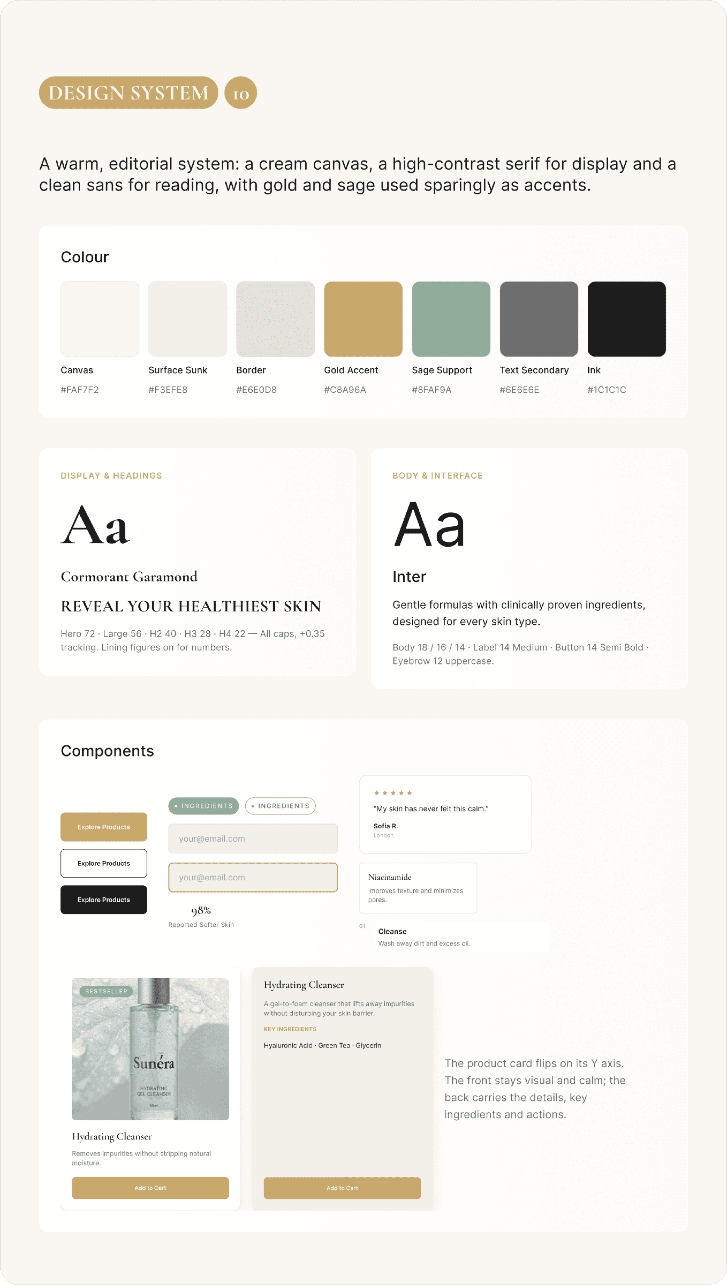
3D flip product cards
The decision: A clean front; hover or tap flips the card to reveal key ingredients, Add to Cart and details.
Why it matters: The grid stays easy to scan and still answers “what’s in it?”.
Ready to buy
A cart drawer, not a page jump
The decision: Add to Cart opens a slide-in drawer with quantity steppers and a live subtotal.
Why it matters: Shoppers confirm and keep browsing without losing their place.

Design system
A warm, editorial system: cream #FAF7F2, ink #1C1C1C, with gold and sage as accents. Cormorant Garamond for display, Inter for reading, 10 token-based components, and calm motion that switches off on touch and for reduced-motion users.
Built in Framer
CMS collections for products, ingredients and testimonials
Cart drawer, persistent cart and one-page checkout
Sign in, sign up and account pages
Three breakpoints with touch and reduced-motion fallbacks

Impact
2 clicks: to any product
14: pages live
12: CMS products
3: breakpoints
Sunera launched as a live, end-to-end store: shoppers find products through a simple routine, understand every ingredient in plain language, see proof before they doubt, and check out on one page.
What I learned
Trust is a layout problem: Proof must sit where doubt happens.
Tokens first pays off: It made the Figma → Framer handoff faster and more consistent.
“Skincare shopping shouldn’t feel like solving a puzzle.”
The problem Sunera solves