All projects
Website
SaaS
2026
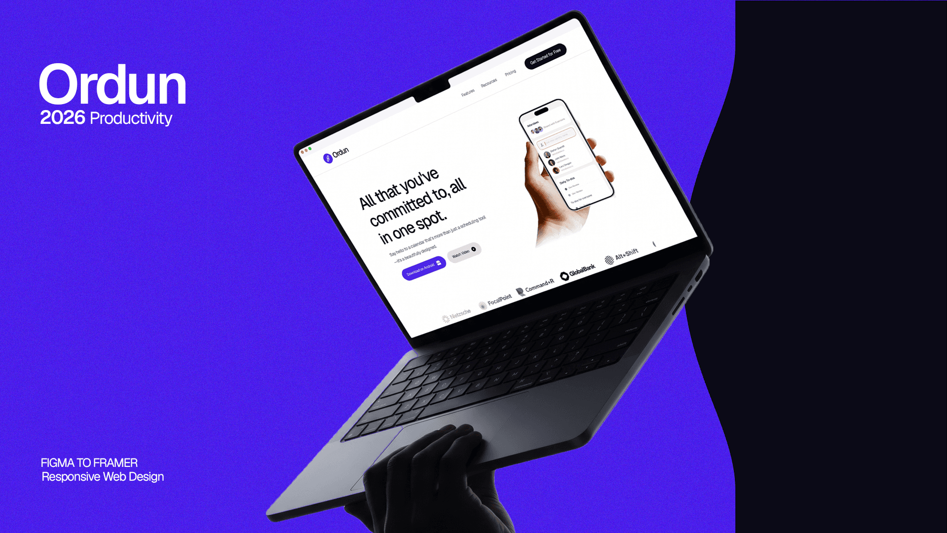
Ordun: all your commitments, in one spot.
A marketing website for Ordun, a calendar and task app that brings scheduling, tasks and reminders together, designed and built in Framer.
Project
SaaS marketing website
My role
Web Designer & Framer Developer
Timeline
2026
Tools
Framer · Figma
8 page types
Landing, features, pricing, blog and more
1 system
Shared components across every page
3 breakpoints
Desktop, tablet and phone
Overview
Ordun is a calendar that’s more than a scheduling tool: tasks, meetings and reminders live in one place. The website had to explain that in seconds and turn visitors into sign-ups and app downloads.
The problem
Productivity apps all sound alike, so visitors scroll past claims they’ve heard before.
Generic promises: Copy alone couldn’t show what makes Ordun different.
Two products in one: “Calendar plus task manager” is harder to explain than either alone.
Pricing friction: Three plans had to be compared quickly, monthly or yearly.
Design decisions
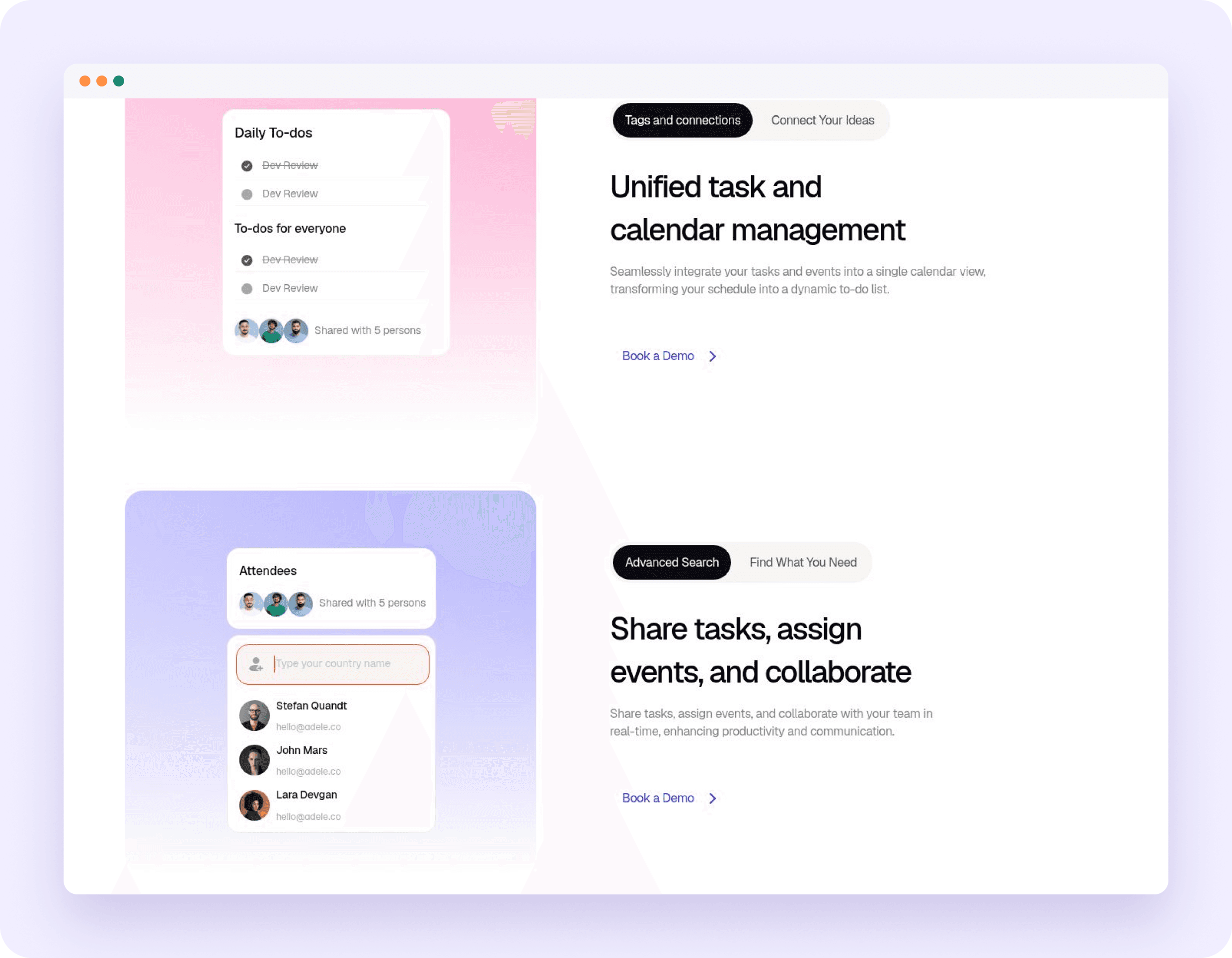
Show, don’t tell
Product UI is the hero
The decision: Pages are built around live-looking app fragments (attendee lists, daily to-dos, a command menu) instead of illustrations.
Why it matters: Visitors see the product working before they read a word.
Two products in one
One unified calendar story
The decision: Tasks and events side by side in a single calendar view, framed as a “second brain” for tasks, notes and ideas.
Why it matters: The combination is Ordun’s real advantage, so it gets its own stage.
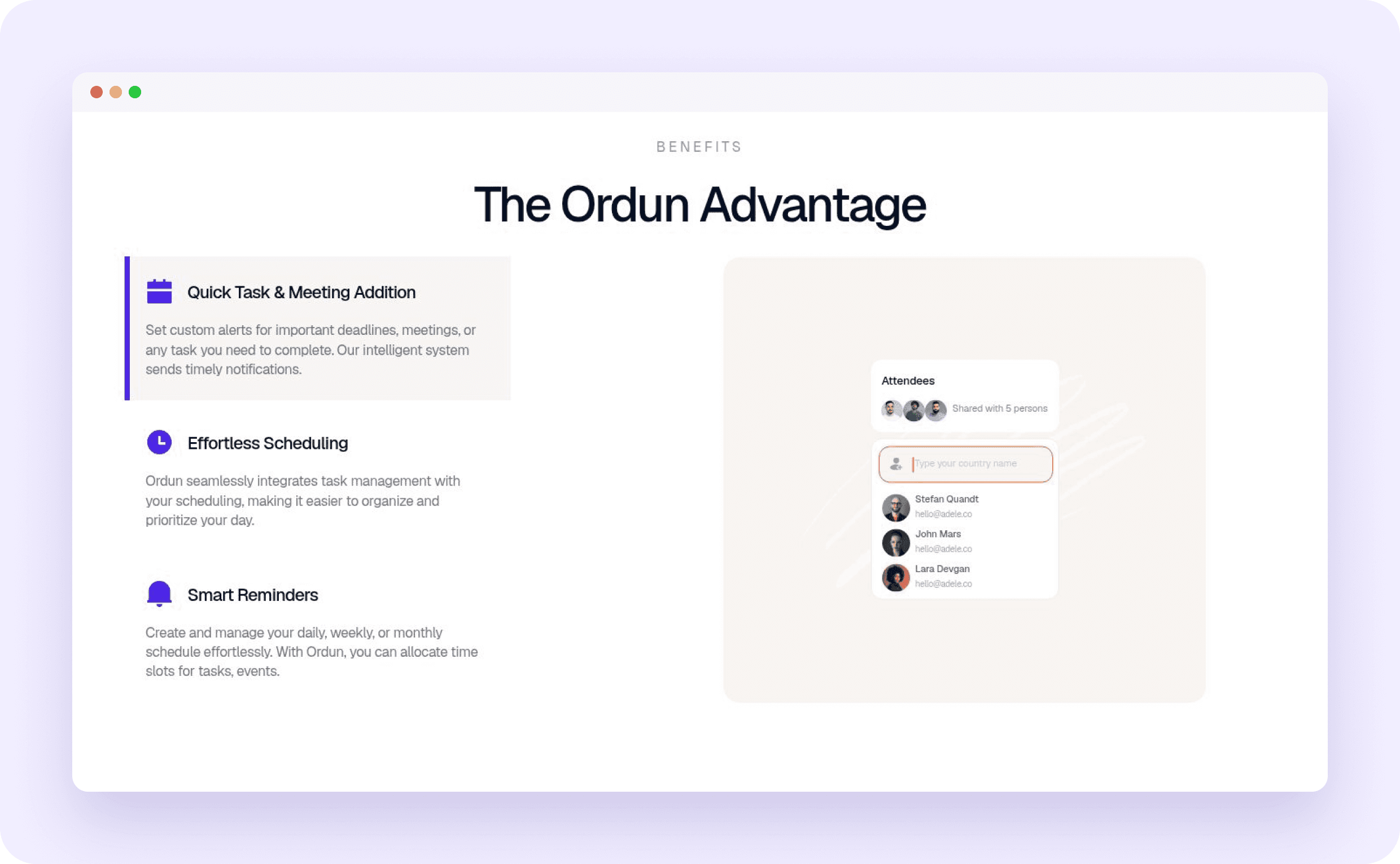
Scannable benefits
The Ordun Advantage
The decision: Three benefit rows (quick task & meeting creation, effortless scheduling, smart reminders) each beside the UI that delivers it.
Why it matters: Three clear reasons beat a long feature list.
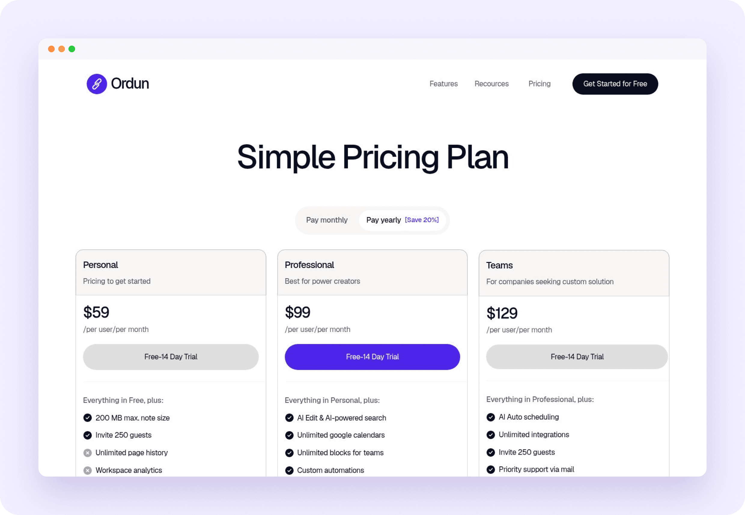
Pricing friction
Three tiers, one toggle
The decision: Personal, Professional and Teams side by side, a monthly/yearly toggle showing the 20% saving, and a 14-day free trial on each.
Why it matters: Comparison and the next step sit together.
Conversion
A next step on every page
The decision: Every page ends with a CTA and app-store buttons; testimonials and an FAQ handle the last doubts.
Why it matters: Wherever visitors stop reading, the next step is right there.

Design system
An Ordun component library in Framer (cards, buttons, pricing tables, testimonials and FAQ) keeps every page consistent and lets new pages and blog posts ship fast. A calm white canvas and one violet accent keep the product UI in focus.
Responsive
Three breakpoints, desktop, tablet and phone. Sections stack, the nav collapses and the product fragments resize so the story reads just as clearly on a phone.

Built in Framer
Landing, features, pricing, FAQ, company and legal pages
A changelog and a CMS-driven insights blog
Desktop, tablet and phone layouts
App-store links and an install-on-device prompt
Impact
8: page types live
1: shared design system
3: breakpoints
100%: pages ending in a CTA
Ordun launched with a site that shows the product working from the first screen, makes the calendar-plus-tasks idea easy to grasp, and gives every visitor a clear next step on any device.
What I learned
Product UI beats illustration: Real interface fragments made a crowded category feel concrete.
Systems speed up content: Building the component library first made the blog, changelog and legal pages quick to add.
“Say hello to a calendar that’s more than just a scheduling tool.”
Ordun hero message
Next project