All projects
E-commerce
Healthcare
2026
Mediora: a calmer way to buy health essentials.
An online pharmacy designed end to end (from finding a product to the order confirmation), so it feels as trustworthy as a pharmacist and as easy as everyday shopping.
Project
Online pharmacy
My role
UI/UX Designer, research to build
Timeline
4 weeks · 2026
Tools
Figma · Framer

3 clicks
From the homepage to checkout
11 pages
One connected flow, no dead ends
43 / 43
End-to-end checks passing on desktop & mobile
Overview
Mediora sells medicines, vitamins, personal care and wellness essentials online. The goal: the warmth and speed of modern e-commerce, with the credibility people expect when they buy something they’ll put in their body. I owned the whole process, from competitor review to the live Framer build.
The problem
A review of six online pharmacies and interviews with five regular buyers surfaced five problems that make people give up and go to a physical store.
Clinical, cold feel: Sites look like hospital forms.
Hard to find products: No clear categories, filters or search.
Low trust: No quick sign the pharmacy is licensed.
Thin product info: Missing usage, dosage and warnings.
Long checkout: Too many steps and surprise costs.
Who it’s for
Amara, 34, busy parent: “I just want to restock and get on with my day.”
Daniel, 61, daily health routine: “I want to know exactly what I’m taking before I order it.”
Design decisions
Problem 01
Clinical, cold feel
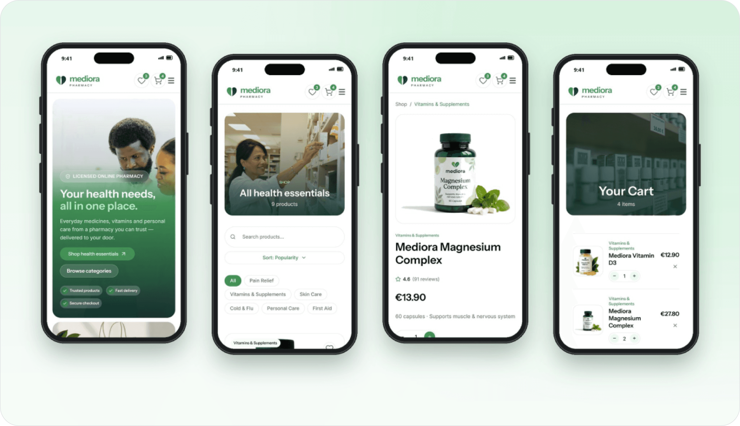
The decision: Warm white and mint surfaces, soft 24px corners and lifestyle photography.
Why it matters: Shopping for health should feel like care, not a hospital form.
Problem 02
Hard to find products
The decision: Category pills on Home; live search, filter chips and sort above the Shop grid.
Why it matters: People browse by need, so the need is the way in.
Problem 03
Low trust
The decision: Licensed-pharmacy and secure-checkout badges under the hero, plus verified reviews.
Why it matters: Trust came before price in research, so proof sits before products.
Problem 04
Thin product info
The decision: Price, rating, stock and delivery above the fold; usage and warnings just below.
Why it matters: Everything needed to decide lives in one place.
Problem 05
Long checkout
The decision: A slide-in cart drawer, then one checkout page with four numbered steps and a visible summary.
Why it matters: Fewer pages, fewer moments to give up, no surprise costs.
Brand & system
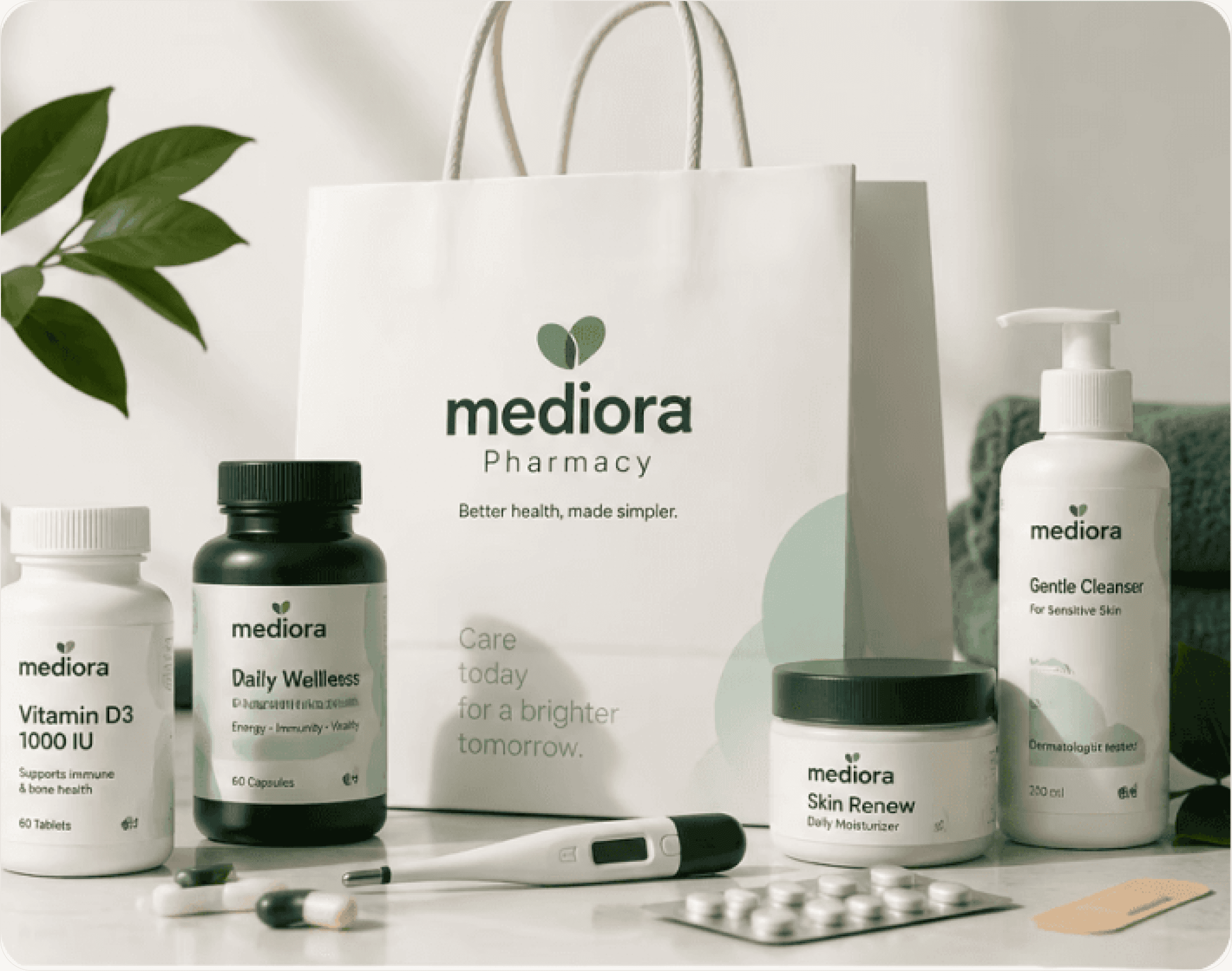
A new mark (two leaves forming a heart) replaced a wordmark that couldn’t work at icon size. Green #429255 signals health; mint #EDFCF1 and white keep it friendly. Instrument Sans and Inter, pill buttons and 24px radii.
Built in Framer
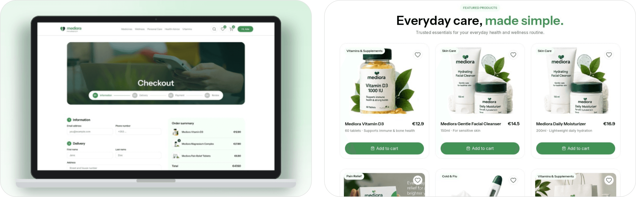
Live search, category chips and four sort options
A cart that updates totals and the nav badge everywhere
Validated checkout with standard or express delivery
Wishlist, accounts and a dedicated mobile layout for every page
Impact
3 clicks: homepage to checkout
1 page: checkout, down from many
11 pages: no dead ends
43 / 43: end-to-end checks passing
Shoppers now reach checkout in three clicks, see trust signals before they see a price, and pay on a single page with no surprise costs, on desktop and mobile.
What I learned
Trust is a design material: Badges, reviews and clear product info did more than any visual flourish.
Flow first, pages second: When each screen has one job, every page gets simpler.
“Buying medicine online shouldn’t feel clinical or confusing.”
The idea behind Mediora